Kicks for clicks
Crafting a seamless shopping experience
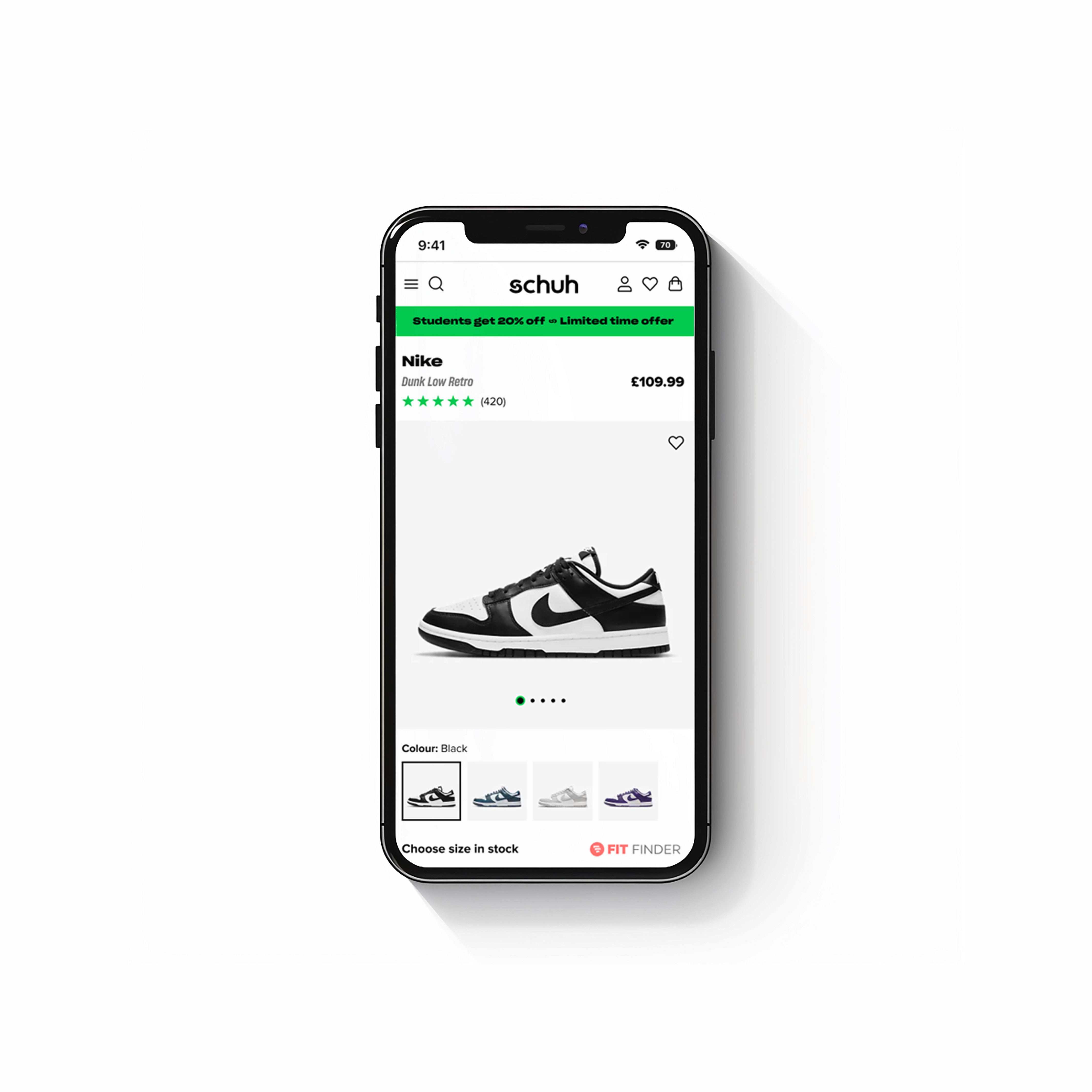
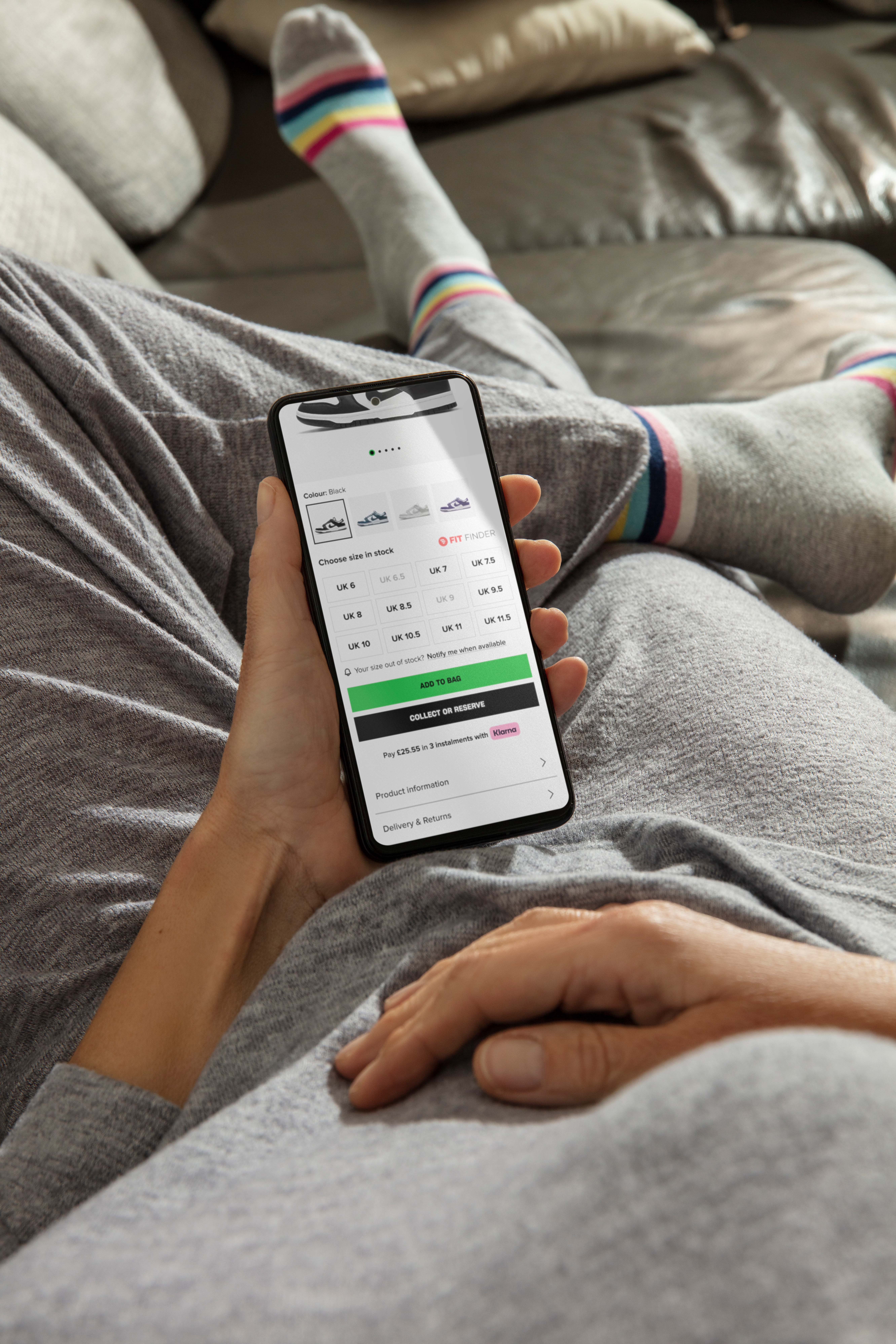
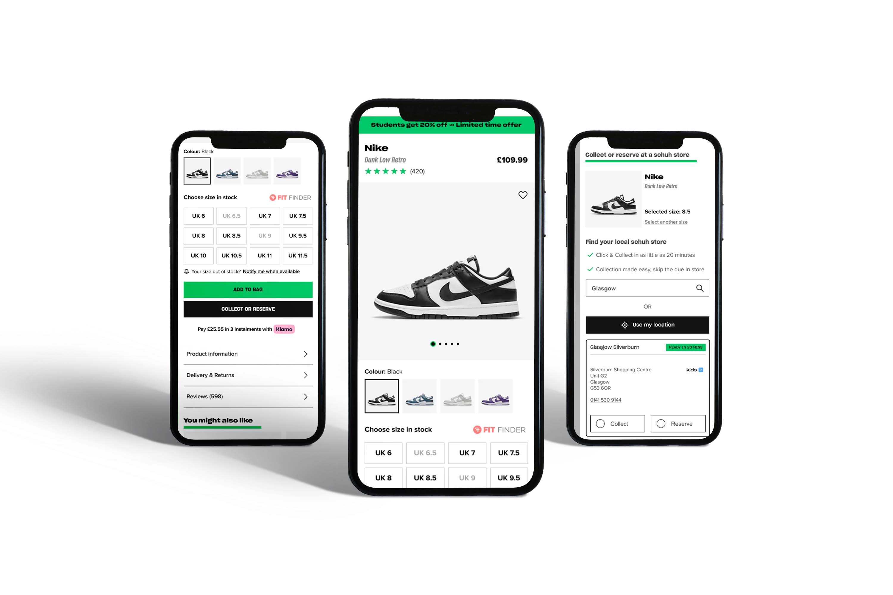
Working closely with conversion rate analysts and the web development team, we began by gathering insights into the users’ pain points on the current product page. We implemented a colour way thumbnail, which improved the user experience by allowing for clearer distinctions between different product colours and options. Additionally, a new header was introduced to ensure critical product information was above the fold, making the experience more intuitive and driving users toward the "add to bag" action. The design was iterated based on user testing and feedback, ensuring optimal usability.
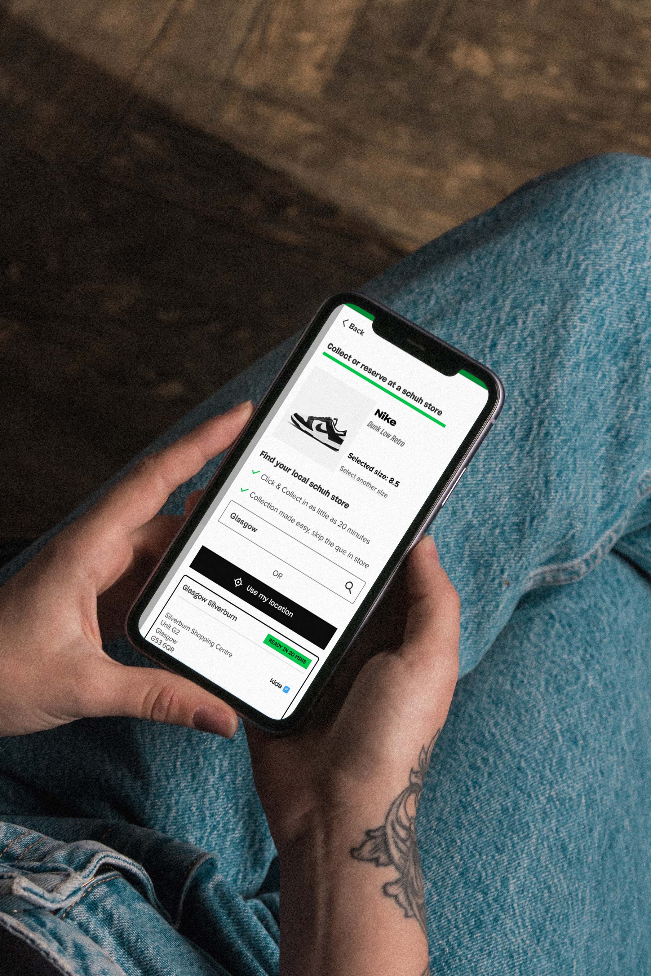
For mobile users, a full-screen overlay was introduced, improving the experience on smaller screens. This responsive approach ensured that users could easily search for local collection points using a tabbed interface, making access to information about pick-up points seamless and prioritised by distance.
Driving engagement through intuitive design
The redesign resulted in a noticeable improvement in user engagement on the product page, with the following measurable impacts:
User engagement increased by 15%, with users spending more time exploring product variations and interacting with the new features.
Conversion rates improved by 10%, as the clearer visual hierarchy and streamlined size-selection process helped users make faster purchase decisions.
The bounce rate on product pages decreased by 8%, as key product information was now positioned above the fold, reducing the likelihood of users leaving the page prematurely.
For mobile users, there was a 12% increase in local collection orders, thanks to the introduction of the full-screen overlay and improved collection point search functionality.
Customer satisfaction scores related to the online shopping experience improved by 10%, reflecting the positive impact of the usability enhancements.
One of the key learnings was the importance of flexibility in design, particularly during periods of uncertainty. Giving users clear, intuitive options for both purchasing and collecting products was critical to maintaining customer satisfaction during the pandemic.
Other projects
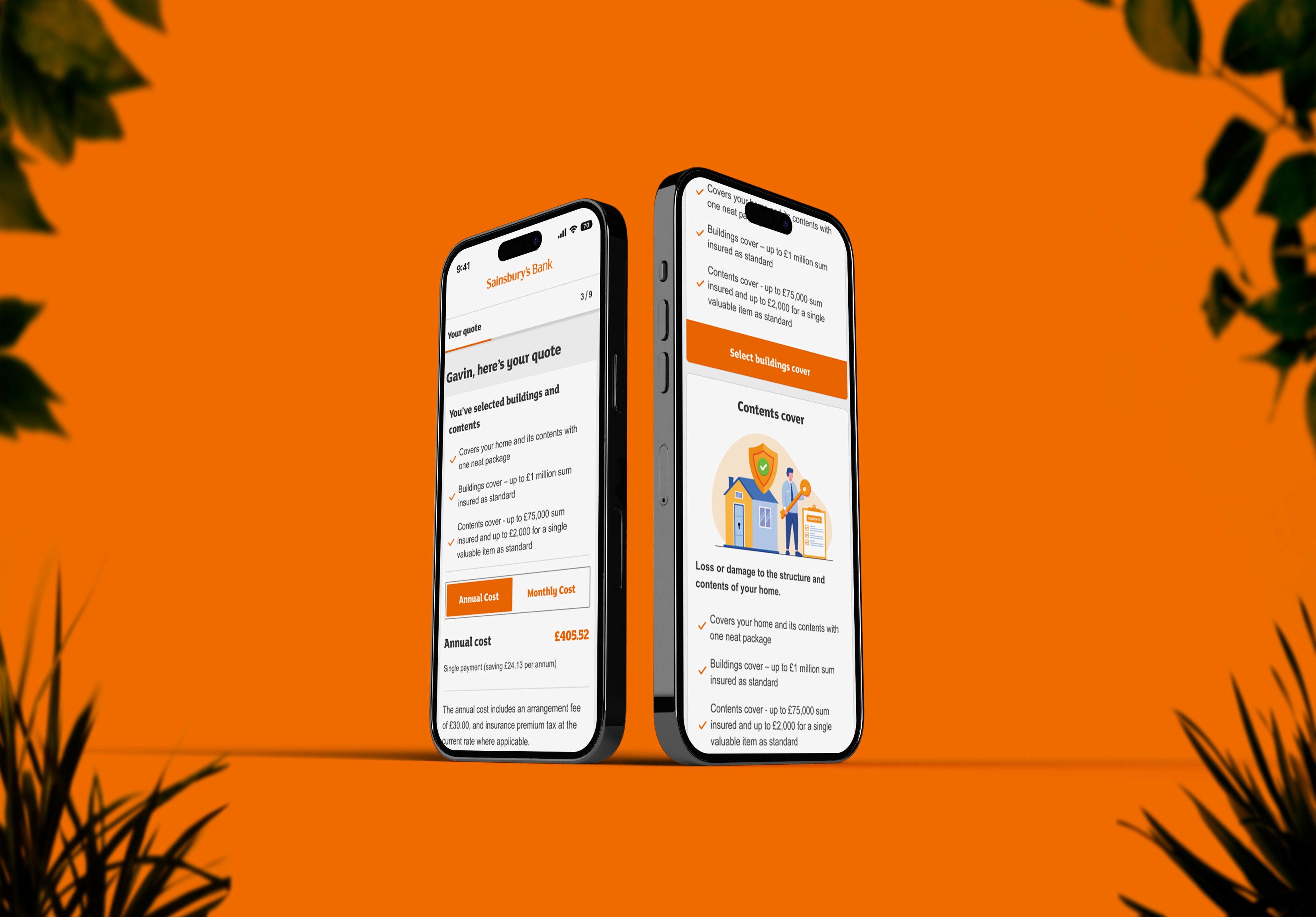
What percentage of your roof is flat?
Find out how I turned confusing questions into a quick and easy process with Home Quick Quote at Sainsbury's Bank.
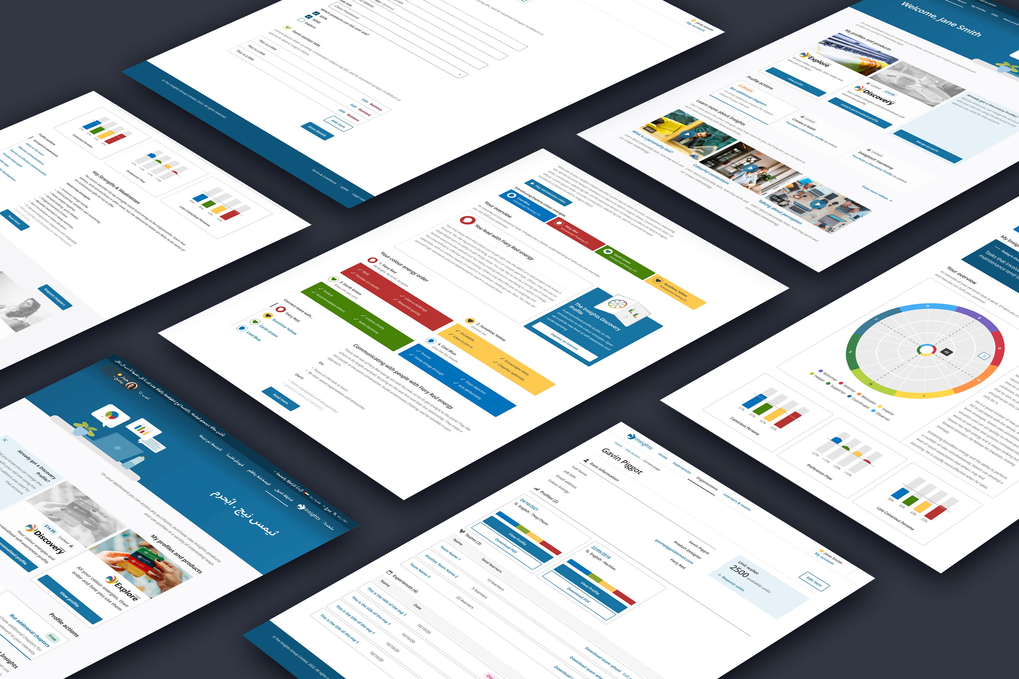
What colours are you?
Helping individuals and organisations increase their self-awareness through colour.
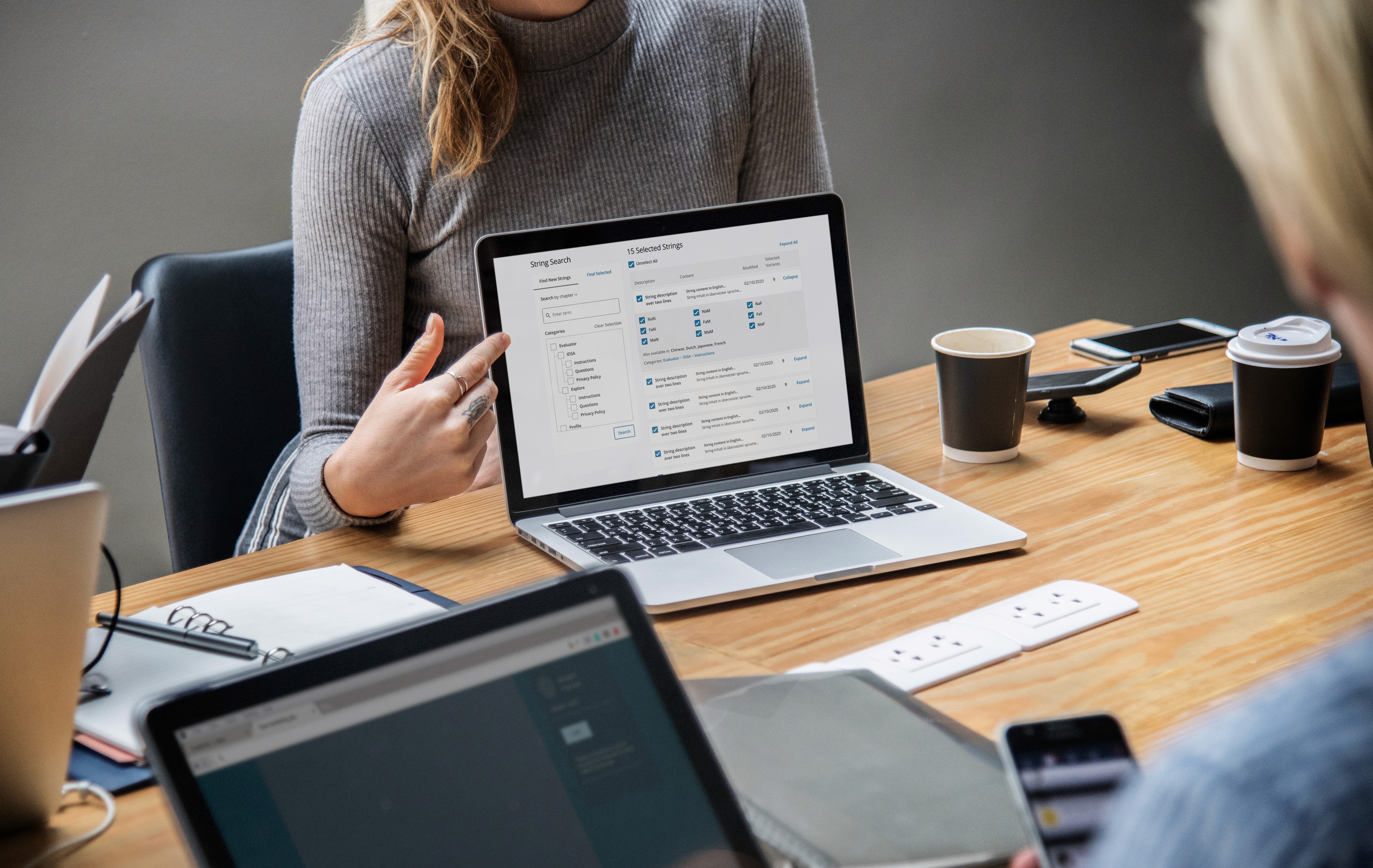
Seamless translation management
Read to see how I made translation management more efficient at Insights.